
How do you add a sensory marketing component to something that’s mostly intangible? This was something I pondered as the launch date for my book Friction approached. A physical book is a tangible product, of course. It’s my preferred medium for reading, for a variety of reasons (including research on recall and emotional impact).
The problem with books today is that most nonfiction books sell fewer paper copies than versions nobody ever touches – ebooks and audiobooks. And even physical books are more often bought from an Amazon thumbnail than an attractive bookstore display.
I realized that what I’m really “selling” are ideas, not just those books made of atoms.
Why did this matter? There’s plenty of research to show that sensory branding and sensory marketing can increase sales and product engagement. So, it seemed worth a try despite the product itself often being intangible.
At least a concept like “friction” is a textural metaphor, a word that might evoke a sensory reaction in the brain. “Rough” is one example. Used in a context like, “I had a rough day,” the word is used as a metaphor but still activates sensory areas of the listener’s brain.
So, my thought’s turned to things that might “feel” like friction – sandpaper, abrasives, rough surfaces, and so on. I ended up doing a couple of things to incorporate sensory marketing.
Cover/Dust Jacket
Book publishers have a long history of enhancing the dust-jackets of hard cover books to make them stand out. Die cuts (a.k.a. holes), embossing, metallic inks, high-gloss varnishes, etc., add to the production cost and are most often seen on books from best-selling authors or new books deemed to have solid sales potential.
Beyond the sensory aspect, an unusual cover treatment sends the message that the book has received extra attention from the publisher and that it might be “important.”
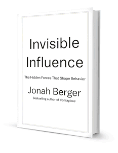 One of my favorite enhanced covers was on Invisible Influence by Jonah Berger. The cover featured a lenticular screen (one of those things that changes depending on the direction you look from). The title was visible when viewed normally, but when viewed at an angle the hidden message, “Everyone’s reading it!” appears. I particularly liked this because the hidden message wasn’t just an attention-grabber, it actually related to the theme of the book.
It seems likely to me that the relevance of the hidden message on Berger’s cover to the book’s topic might produce a bit of an “aha!” effect as the viewer’s mind puts the two elements together like pieces in a puzzle. Neuroscientists have found the brain’s anterior cingulate cortex (ACC) is where the aha! effect is processed.
 So, my first thoughts were to use a gritty, sandpaper-like coating on part of the Friction cover. I had actually seen a cover like that on a book by one of my podcast guests. When I asked him about the coating, though, he told me that there was a small problem. Some booksellers had complained that when the books rubbed together during shipping or on the shelf, the adjacent book’s cover got scratched.
I didn’t want Friction to be a retail pariah, so I gave up on the truly gritty cover.
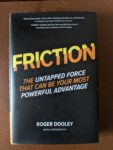
Instead, my publisher, McGraw Hill, found a coating that was bumpy enough to symbolize “friction” without being so aggressive that it damaged its neighbors. It’s a bit hard to see in the photo, but the texture is there:
Results. Many of the people who pick up the book mention its unique feel. Most of those who notice make the connection and say something like, “Oooh, friction!” I’m sure others who feel the physical book process the texture at some level as being “different” than the typical cover.
Medical marketing expert Omar M. Khateeb used the “high friction” cover for a little physical comedy to kick off his review of the book on YouTube:
Of course, when even most physical book buyers never touch the book until the Amazon truck drops it on their doorstep, it’s hard to say the cover drove many sales. Rather, like unboxing an Apple product, the unusual texture primes the reader for a quality reading experience.
Can you use sensory marketing to sell an intangible produc, service, or even ideas? Here are examples. #Neuromarketing Click To Tweet
Sensory Marketing via Business Cards
Who needs cards, anyway? I often meet people who say, “I don’t have business cards any more. People just throw them away.” In fact, a couple of years ago I thought I’d go the cardless route myself. Who needs them when you’ve got LinkedIn, Facebook, Gmail, and plenty of other ways to organize your contacts?
My plan proved to be either too far ahead of the time or, more likely, simply wrong.
The first time I spoke at a conference without cards, at least a dozen people asked me for one. Initially, I explained how pointless paper cards were in our digital, mobile-first era.
Then I realized how ridiculous it was for me to lecture people on why I couldn’t accommodate their simple request. So, I switched to, “Sorry, I’m out. Let me have one of yours and I’ll connect.” By the next speech, I once again had a fresh supply of cards.
But, how could I add a sensory marketing element to coincide with the launch of Friction?
Don't write off business cards as a marketing tool. People still ask for them, and they can convey a unique impression for you and your brand. #Neuromarketing Click To TweetFrom Russia with Touch. When I was speaking in Moscow a few years ago, I was given a card that impressed me so much I wrote a blog post about it. My friend and neuromarketer Oleg Klepikov handed me an unusually thick business card. The top was smooth and had his contact information like any other card. But, when I felt it, the bottom of the card wasn’t smooth. My fingers told me there was something there.
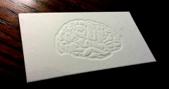 I had no choice but to immediately flip the card over. There, I found an embossed brain. Like Berger’s “invisible” cover message, the brain related to Klepikov’s work. So I had the surprise of discovering the hidden design and, milliseconds later, the realization of how it related to the business concept.
Unlike most embossed cards, on this card the pattern could be felt and seen only on one side. At the time, I vowed to try to find a way to use a similarly creative idea.
A few years later, I had my chance. When the release of Friction was approaching, I started hunting for a friction-themed card. Once again, to add a sensory marketing element I focused on a “rough” or “gritty” concept.
I found at least one company that would print business cards on actual sandpaper. Those were definitely high friction, but the colors and print detail one can attain on sandpaper are limited. They seemed like a better choice for, say, a woodworker or cabinet salesperson.
 Hot cards. One concept I really liked was a business card with a coated area rough enough to strike a match. Very, very memorable, and illustrative of friction in action – what’s not to like?
This would have been perfect from a branding standpoint. But then it occurred to me that TSA airport security staff might take a dim view of carrying a bundle of highly flammable, easy-to-light matches onto airplanes. Event coordinators and conference organizers might get upset if a Friction fan accidentally ignited a curtain or exhibit. I still love this idea, but I saw too many ways it could go wrong.
Want a HOT business card idea? People will remember this one. But, check your liability insurance. #Neuromarketing Click To TweetThe wrong kind of friction. One printer had examples of a UV grit coating applied to part of a card’s design. This seemed like a possibility. Unfortunately, the coating wasn’t the only high-friction aspect. This printer had no online pricing tool or even a simple quote request form. To get a quote, one had to download a full page PDF form and fill it out. This high-effort, outmoded process was a prime example of pointless friction.
Today, most printers let you fill in a few blanks online, tweak your design, and place your order. So, I did what I suppose most of that companies visitors do – I left without taking action.
The winner. I finally came up with a design that had all the characteristics I wanted:
- A substantial, high-quality feel.
- A smooth top surface that gives no clue about the other side.
- A very tactile feature on the bottom that compels the person to flip it over.
- A sensory feature that produces the “aha!” effect within a second or two.
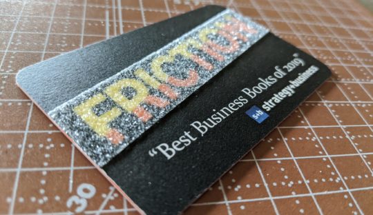
The front of the card is fairly typical – name and contact info. The back is where the sensory marketing fun happens. First, I used the “Friction” design from the book’s cover, keeping the font, colors and angle for consistent branding.
Covering the title is a transparent, very gritty strip. It may take a few milliseconds to resolve the word “FRICTION” because of the grit, but I think that’s OK. It’s perfectly legible, and a little disfluency will make it even more memorable.
The Results. I hand the card to people with the normal-looking, smooth side facing up. It’s hard to handle the card without feeling the grit on the bottom, though, so almost everyone turns the card over to see what’s on the other side. The most common response is a smile as they make the connection between the high friction surface and the book title underneath it.
Other Sensory Marketing Tactics
These examples focused primarily on the sense of touch. Books, like most products and services, are mostly marketed visually. Cover designs, digital ads, print promotions, and so on. Perhaps in another article I’ll share how eye-tracking data informed the choice of dust jacket color.
Even for intangible products and services, other senses come into play. Wireless companies may use a distinctive ring tone. Computer brands may have a branded boot-up sound. Brands that control an environment, like airlines, hotels, and restaurants, may use particular scents and sounds to enhance brand recall and improve customer experience.
Starbucks relies on the aroma of roast coffee beans to enhance the brand experience, and even stopped selling egg products that had a less enticing aroma. Supermarkets are another environment where all five senses can be used.
Friction Takeaway
In Brainfluence, every chapter ends with a “Brainfluence Takeaway” paragraph that summarizes how to apply the preceding content. I did the same thing in Friction, so it seems fitting to use that approach in this article, too:
Whether your product is tangible or not, try to incorporate sensory marketing elements into at least a few aspects of your promotion. These should be consistent with each other, and, if possible, relate to your product or what it does. Invoking additional senses will make you and your offering more memorable.
Want people to remember your product, service, or brand? Go beyond visual marketing and appeal to their other senses. #Neuromarketing Click To Tweet
Muy interesantes los ejemplos y el artículo del Marketing sensorial con tarjetas, sobretodo que yo también soy una de las que hoy no las ocupo, pero después de estas experiencias pondré algunas en mi cartera.
Me interesa aprender más sobre Neuromarketing y veo que este blog entrega información muy relevante