
User Experience (UX) Design is about identifying, understanding, and solving problems (see UI vs UX). UX Design also requires a careful balance between aesthetics and usability or form and function. It is much more than “making it pretty” (see Design is not Decoration).
I like to use relatable examples to explain abstract concepts. This time, I’ll use cake. Great design is like a great cake 🎂 🍰 🧁.
When you buy a beautiful cake and bite into it only to taste a dry, flavorless mouthful, what a disappointment! A great cake needs to taste as great as it looks, and vice versa. In addition, a cake is often intended for a specific occasion. It might be for a summer party outdoors (so it better not require refrigeration!) or for a wedding (so it better be big and fancy!) or for a group with dietary restrictions (so it better be vegan/nut-free/gluten-free!).
A well-designed cake looks great, tastes great, and is perfect for the people and occasion it was intended for. In the same way, well-designed software solves a problem for its users in a way that looks great and is easy to use.
That makes sense, right?
So you put in a lot of effort to understand the problem and the users, and then get to work crafting a beautiful solution. Then comes the feedback.
After a few rounds of design feedback, projects often go off the rails. At this stage, we lose sight of the problem, people start pointing fingers, and designers feel forced to make changes that ruin the design. (Have you ever seen this classic comic on The Oatmeal about the process?)
Just as we must understand problems before jumping in and designing solutions, we must understand design feedback before jumping in and making changes. We must peel apart the layers of aesthetics, usability, functionality, and personal preference to find a solution.
Coming back to the baking example, let’s think through how these factors come into play.
Benny’s Bakery
Benny has a famous bakery for cakes. One of his most popular cakes is his signature chocolate cherry cake.
Charlie wants to purchase one of Benny’s cakes for an upcoming party he is planning. He asks for recommendations, and Benny offers a sample of his signature cake.

Charlie tries the cake, and comments, “This is great! I love the flavor combination. But, hmm, I don’t know, it doesn’t seem quite… chocolaty enough.”
How should Benny respond? Here are three ways this might play out.
1: Benny makes a change without clarifying the feedback.
Benny was very careful to create the right balance of flavors in his chocolate cherry cake. Adding more chocolate or removing some cherry would throw off the balance, so he suggested a chocolate cake for Charlie instead.
Charlie replied, “I really like the chocolate cherry flavor, I just think it would be better if it was a little more… chocolaty, somehow.”
Benny wasn’t one to argue with his customers, so he added more chocolate and less cherry between the layers. In the end, the cake was okay, but it wasn’t quite what Charlie was hoping for. Maybe he should have gone with a chocolate cake after all, he thought, or maybe he should have just gone to another bakery to find something just right.
Benny reacted to the feedback without fully understanding the problem. He wasn’t able to improve the cake for Charlie.
Here’s another way this could have played out:
2: Benny clarifies the feedback before making changes.
After Charlie requested a more chocolaty chocolate cherry cake, Benny asked for more information.
“Before suggesting a change, I want to make sure I know what it is that you’re not liking. Can you be more specific? What do you think about the cake itself? And what about the filling and frosting?”
Charlie thought about it and replied, “I like the cake very much, and the chocolate cherry filling is great. Hmm, you know, maybe it’s just the frosting and decoration. It has a lot of pink and cherries. It’s a little too, I don’t know… feminine, maybe? Maybe you could just decorate with more chocolate instead of cherries?
Now Benny understood what was going on. Charlie liked the flavor, but it was a little too frou-frou for Charlie, so he felt funny serving it at his party. With this knowledge, Benny redecorated the cake with chocolate-covered cherries and white frosting. The result was almost identical in flavor but had an appearance that matched what Charlie was hoping for.

Benny and Charlie were both happy with the result. Charlie would definitely return in the future, his friends at his party loved the cake so much that Benny got new customers, and Benny got new ideas for styling his cakes for wider appeal.
By clarifying Charlie’s feedback, Benny realized that what sounded like an issue of flavor was actually an issue of appearance. By identifying this, he was able to adjust the cake perfectly.
But what about personal preference? How does that factor in? Obviously, Charlie’s personal preference is for a masculine cake, but sometimes personal preference needs to be identified and then ignored.
3: Benny factors in personal preference
Benny understands what Charlie wants but also wants to ensure it’s the right choice for his party. He says, “I think you mentioned that this cake is for your wife’s birthday party. Does your wife prefer things not to be too feminine?”
Charlie thought about it and realized, “No, actually, she loves pink very much. She loves chocolate, but the only thing she loves more than chocolate is pink. You know what, leave it as is. Or if you can make it even more pink, do it! I was thinking about the guests at the party, but now that you mention it, this cake is really for her!”
Benny decided to use a pink cardboard base for the cake and stick to the original cake design.

The result was perfect. The cake was a hit at the party. It reminded everyone of Benny’s wife, and it tasted amazing.
Benny recognized that Charlie’s personal preference was for something less pink, but that Charlie’s personal preference might not be the most important for this cake. By talking it through, he helped Charlie realize that what he wanted was not what was best at all.
Separating issues of aesthetics, flavor, and personal preference is critical for Benny if he wants to bake the right cake for each customer and each occasion. Similarly, separating issues of aesthetics, usability, functionality, and personal preference is critical for software design.
A Software Example: Lydia’s Landing Page
Lydia has hired Designer Dave to design a landing page encouraging users to purchase her company’s new product. This was her first assignment at her new job, and she really wanted it to turn out well.
Dave put together a page with a prominent orange “Buy It Now” button that matched the product’s branding.
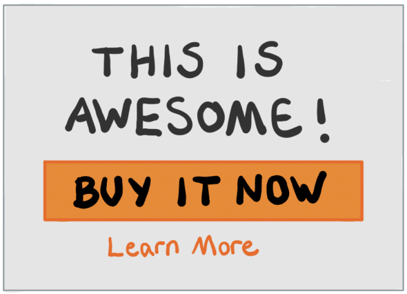
After sharing the mockup with Lydia, she commented, “This is looking great! But, well, I’m not sure about the button.”
Dave explained, “The call-to-action is the most important part of the page. It is important to make it clear. And it is orange to match the product’s branding.”
Lydia responded, “Ok, but it’s just really, I don’t know, too big? Too bold? I just really don’t like how it looks there.
There are a few ways this could play out:
1. Dave makes changes without clarifying the feedback.
Dave was frustrated. Why couldn’t Lydia understand how important it was for the button to be big and prominent? He threw up his hands, then got to work on a new version with a smaller, more muted button.

Lydia still wasn’t sure about the button. But Dave had done what she asked, right? Not wanting to cause more delay over a button, she decided to accept the design and move forward.
Lydia had a problem, and Dave made changes without understanding it. Now, both the aesthetic and the usability have been compromised. The button no longer functions as a successful call-to-action. Neither Lydia nor Dave are happy with the outcome.
Here’s a better way this could have gone:
2. Dave clarifies the feedback before making changes.
Dave, sensing some misalignment, offered more explanation and asked questions to clarify before making any changes.
“The call-to-action button is the most important part of the page, so I made it very large. And because the primary brand color is orange, I matched that. Do you feel like too much orange is being used? Or do you think I have given the button too much prominence?”
After giving it some thought, Lydia replied, “I agree that the button is the most important thing. It should definitely be prominent. You’re right that the brand color is orange, but it does feel like a bit much. Maybe what you did is fine, but could you try it in another color that works with the brand?”
Understanding that Lydia’s issue is aesthetic, Dave modified the design, using a secondary color that worked well with the branding.

Lydia liked it much better, and both Dave and Lydia felt good about where it landed. The page looked great, on brand, and served its purpose perfectly.
By clarifying Lydia’s design feedback, her goals were better understood. With a better understanding, Dave put together a well-balanced design that met her needs.
But where does personal preference factor in? Should Lydia’s preference for avoiding orange really steer the direction of the project? Here’s one more example, taking this into account.
3. Dave factors in personal preference.
Dave has been working hard to establish consistent standards based on the company brand. A lot of time and money was invested into the branding guidelines. It was backed by market research and already had buy-in from many internal stakeholders.
Lydia is relatively new to the company and wasn’t caught up to speed with any of this history. All Lydia knew was that she was tasked with hiring a designer and monitoring work on a landing page to sell the new product. She had a strong, negative reaction to the orange and believed that users would feel the same way.
Before making any changes, Dave decided to catch Lydia up on the brand work. He walked her through the branding guidelines and the research behind them. He showed examples of other materials that used the branding. Lydia quickly realized that orange was the right color to use.
Dave didn’t change the design just because Lydia didn’t like it. He listened to her feedback, identified it as aesthetic and personal preference, and helped give Lydia insight into the larger business impact of using (or not using) a big orange button. With Dave’s help, Lydia was understood, informed, and empowered to make the best decision for her business.
Don’t Dismiss Feedback. Understand it.
All the examples here are intended to show why we must ask clarifying questions and avoid making assumptions when accepting feedback. It can be difficult to understand and categorize design feedback, and you might be tempted to use labels to dismiss valid feedback.
“He doesn’t know what he’s talking about. He’s just commenting on his personal preference.”
This sort of reaction damages working relationships and leads to poor outcomes that fail to solve the problems at hand. Never use these labels to ignore feedback. Use them to clarify and understand.
Wrap-up: Design Feedback Basics
- When you receive feedback, make sure you understand it.
- To understand feedback, it helps to separate issues of aesthetics, functionality, usability, and personal preference.
- Do not use these labels to dismiss feedback. Use them to clarify and understand it.
What stories and advice do you have about dealing with feedback?