The Minnesota Wild entered the league in 2000 as an expansion team. It has been 18 years since they entered the league, and their jersey collection has steadily been growing over the years since. Reports have come out saying that Adidas will resume alternate jerseys starting with the 2018-19 season. With that being said, I thought it would be a good time to take a trip down memory lane and rank every jersey the Wild have worn.
10. 2007-08 Reebok Away
This white jersey was unveiled when Reebok took over as the NHL’s jersey supplier from CCM. The jersey is basically an exact replica of what CCM did with the original white jersey. It features the bear logo front and center with the script patch on the shoulder. The only real differences are the NHL logo on the collar and that the stripes throughout the jersey are thinner.
For fans at home, the jersey’s patch is a cheaper material and the jersey is more snug, making it less breathable. It’s certainly a nice jersey but it easily stands out as the worst jersey the Wild have ever worn.
9. 2000-01 CCM Away
When CCM was still the league’s jersey supplier, the white jerseys were home jerseys and the colored were for the road. That means that this green jersey was an away jersey at the time. It’s a nice jersey but it’s very plain. The bear logo is front and center on a green jersey with some red and gold stripes throughout. The shoulder patch is the original circular scripted Wild logo.
8. 2000-01 CCM Home
It is virtually the same jersey as the away except where the away jersey was green, this one is white. There isn’t much creativity to this jersey, but it remains an awesome jersey because it’s the original home sweater and every original fan owns one. There is a reason you still see this at home games in the Xcel Energy Center.
7. 2007-08 Reebok Home
This jersey is known as the “Christmas sweater” due to its bold red dominating the jersey. It’s the exact same jersey as CCM’s original alternate except for one line running across the shoulders, the NHL logo on the collar, and the removal of the giant green section at the bottom of the jersey. Reebok obviously got pretty lazy with these initial designs for the Wild jerseys.
6. 2016 Reebok Stadium Series
The Stadium Series sweater marks the beginning of the great Minnesota Wild jerseys. Again it features the bear logo across the front as nearly all of the Wild jerseys do. It’s green throughout except the shoulder area, which has a wheat color where the shoulder patches are. The bottom features one single line that is wheat as well. The sleeves have large singular red and wheat sections stacked on top of each other.
What makes this jersey stand out from their other selections is the shoulder patches. The left side features the classic “State of Hockey” logo that has the shape of Minnesota and those words within the shape. The right side has the neat Stadium Series patch (jersey buyers have to purchase separately). It has a really nice blue color, and the trees certainly stand out.
5. 2009-10 Reebok Alternate
The green alternate from Reebok was the first bold attempt at a new Wild jersey. In fact, to this day it remains the only jersey that doesn’t have the bear logo on the jersey at all. Instead, the jersey features the words “Minnesota Wild” in script style. It is very reminiscent of a baseball jersey. The sweater features the least amount of color from any Wild jersey as well, due to it being almost completely green and wheat.
4. 2003-04 CCM Alternate
This is the jersey that inspired Reebok to use as the Wild’s home jersey when Reebok took over as the NHL’s jersey supplier. The logo in the center features the same bear logo but around it, in a circle, there are two stars to the sides with the word “Minnesota” written above and “Wild” written below. It was a unique way to change the jersey yet still have the same logo that the team had been using on its other two jerseys.
This was the first jersey to feature the strings on the collar, and the bottom has a beautiful green stripe that really pops and doesn’t allow the red to swallow up the jersey’s design.
3. 2017-18 Adidas Away
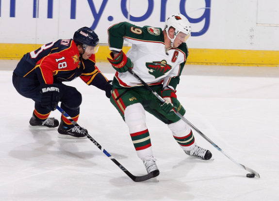
When Adidas took over as the NHL’s jersey supplier this past season, many teams didn’t get new jersey designs. The white away jersey that Adidas used is very similar to the recent update that Reebok made a few years back. The only differences are the stripes on the sleeves are moved slightly up, the NHL logo is shiny, the strings are purely for show, and it says “Adidas” rather “Reebok”, obviously.

It’s not really much of a change for a jersey, but the current away design the Wild have been using is one of the nicest looking jerseys in hockey, especially with the red numbers on the back. Owners at home will also notice the shoulder patches are made from better material and are actually stitched on.
2. 2013-14 Reebok Away
This jersey obviously gets the nod as the better jersey since Reebok came up with the original design. The green stripes on the sleeve look sharp and the green strings give the jersey extra flavor. The shoulder patches are the same center logo from the red jerseys used in years past.
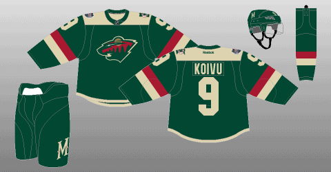
1. 2017-18 Adidas Home
The best jersey for the Wild is easily the new green Adidas jersey. The bear logo on the front has never looked better. The wheat stripe going through the center of the jersey looks really sharp. The wheat and red lines on the sleeve stand out, and the red border along the numbers on the back make the numbers pop out.
The material feels extremely nice and breathable. The shiny NHL logo is one of the highlights of the new Adidas jerseys, but the strings being purely for show is the only thing that makes the new Adidas jerseys not look as nice as Reebok jerseys. The shoulder patch features the “M” with the star through it as a nod to the old alternate green Reebok jerseys with the script logo. It’s a beautiful jersey, and Adidas has their work cut out for them if they want to top this sweater.