

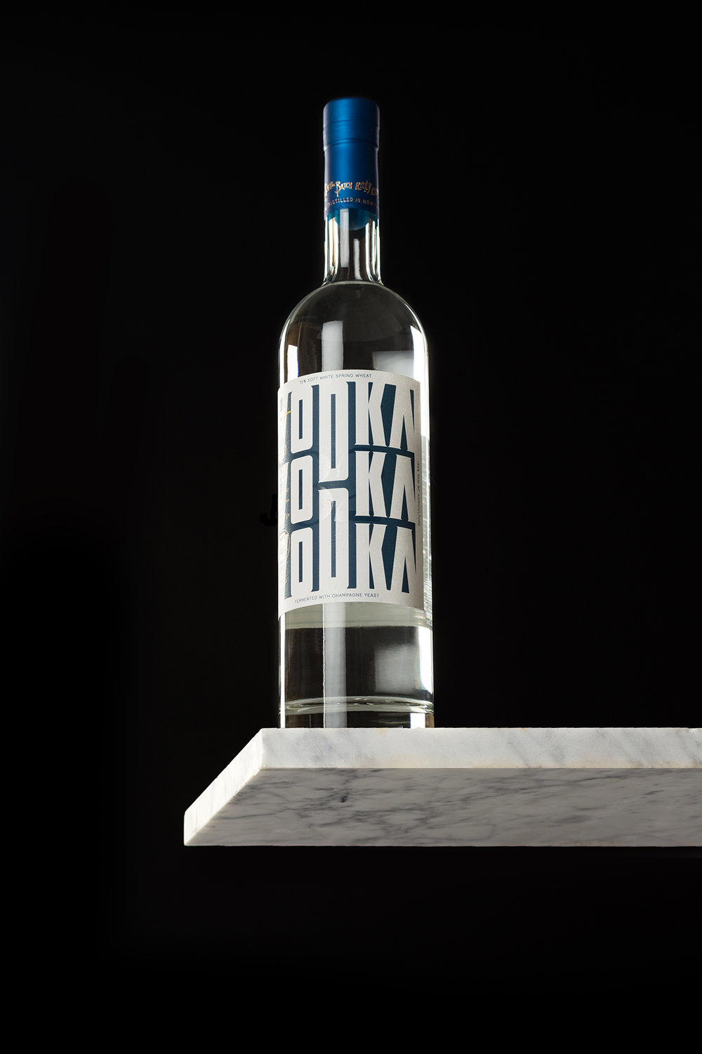
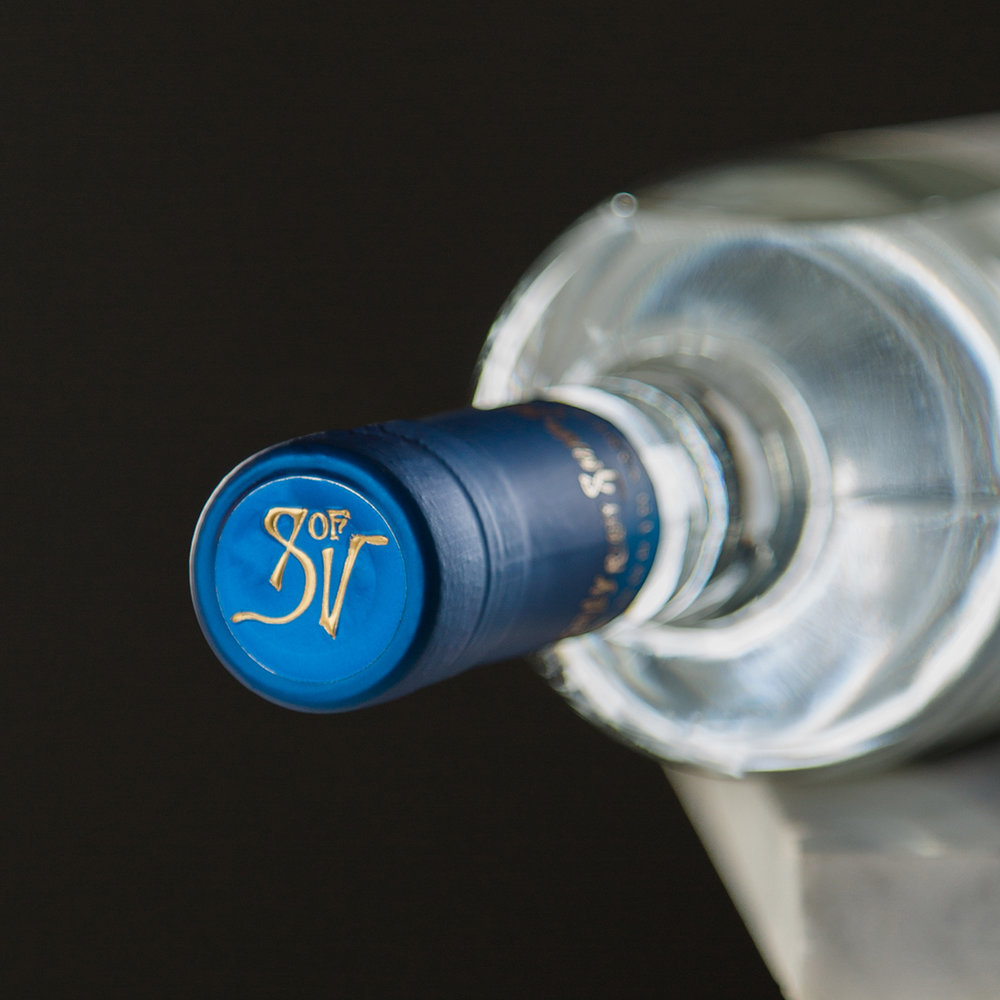
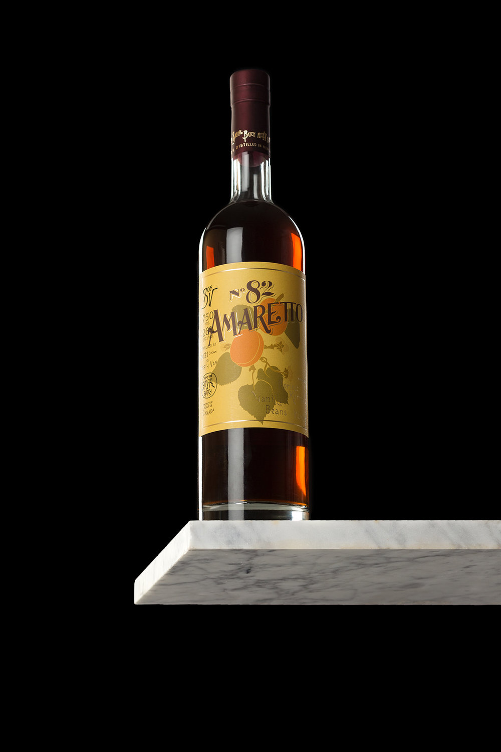
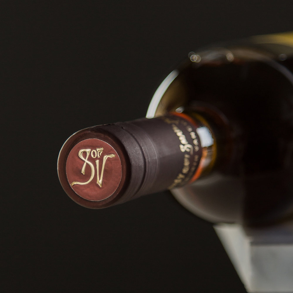
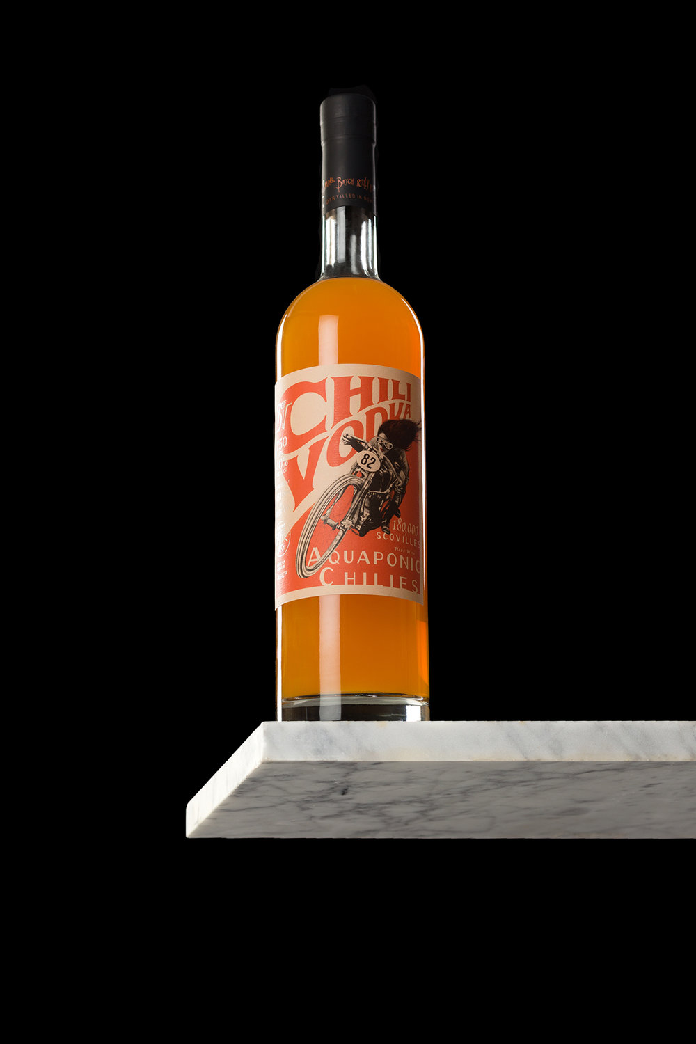
Canadian agency Palms designed the Art Nouveau driven packaging for a variety of spirits from Sons of Vancouver Distillery.


“Palms worked closely with really really small batch distillery Sons of Vancouver (SOV) to create a brand and packaging that reflect the hands-on consideration of their distilling process.
Inspired by the ornateness of Art Nouveau, the identity system elevates SOV while maintaining their independent vibe. Illustrations created in-house pair with custom wordmarks to suit each spirit and emphasize a handmade feel.”

Designed By: Palms
Location: Vancouver, Canada


