

Google Campus in Warsaw definitely went above and beyond with this amazing gift. The design takes a minimalistic and geometric approach for a limited edition old style flavored vodka. We interviewed Maciej Frymus who worked with Redkroft to learn more about the process for creating this elegant vodka, designing without solid visual guidelines, the importance that prototypes played in the process, and more.
Walk us through the design process that you went through for this project.
Redkroft: After we have agreed what we want to do and how the design should look like more or less, we had to add some extra value to it. Silkscreen printed graphics and pleasant to touch papers were our weapons of choice. We were aware that it would be more special if you could actually tell it was made with care and attention to details. It’s hard to achieve on a factory line but we all agreed it should be made and assembled 100% by hand.
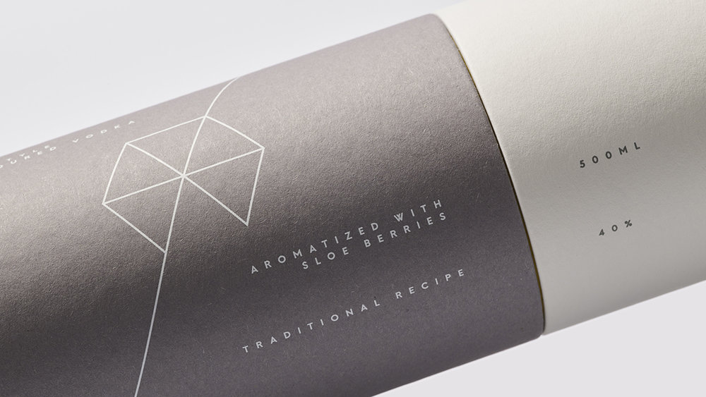
After the initial designs were made, we carefully picked available papers. We went with a Kreativkarton set, because it had all the colors we needed and it has a nice texture, somehow it feels a bit warm when you touch it.
Silkscreen printed graphics added the pleasant embossment which you can feel with your fingertips. Manually applying the sealing wax was a bit painful but it was just a small inconvenience in the whole process. To add some extra architectural detail, we have decided to wrap the bottle necks with a silkscreen covered calque, commonly used in architecture studios.
After dozens of mockups and prototypes we were ready to go with the production.


What was one of the biggest goals you set out to achieve with Google Campus: Old Style Flavoured Vodka packaging and how did you accomplish it?
Redkroft: Having Warsaw Campus’ visual style in mind, we had to come up with and design a unique gift to be handed during special occasions. We decided that we couldn’t ignore the location of the Campus—an old, almost legendary vodka distillery. The Koneser is a very interesting example of European industrial architecture of XIX/XX century, strongly influenced by gothic style and it’s one of the very few buildings that survived the tragic WWII bombardments of Warsaw. With all that in mind, it was rather obvious the gift would be a bottle of vodka. The rest was a matter of aesthetics.

What was the most challenging part of this project?
Redkroft: At the time, Campus Warsaw, similar to other European branches, had no brand manual or any sort of solid visual guidelines. Each branch’s designs were based on intuition and a general sense of the brand rather than strict directives. Our design had to fit in visually with a style that was still not fully established without straying too far away. After several years of working in branding you get the idea of it but it was still quite challenging.
How did you go about combining the aesthetic of Google and the history of the building?
Redkroft: Campus Warsaw is “a Google space” which means it’s powered by Google but it doesn’t share the visuals. Technically, it’s a separate thing. Google’s brand manual has been in use for a while now but it never applied to Campus Warsaw.
The main link between the project and the building is the nature of the gift—it’s vodka, the first thing that comes to mind considering the Koneser’s history. Secondly, it’s the shape and edges that draw inspiration from gothic style of architecture. We limited the palette to the three colours used in Campus’ logo and we went with a geometric, architecture-inspired theme. We distanced ourselves from typical strong alcohol designs and kept things simple and minimalistic to make it stand out. And while we do believe less is more, we couldn’t resist using fancy white sealing wax as a final touch.


If you could pick one aspect of the finished design that you like the most or feel especially proud of, what would it be and why?
Redkroft: It’s hard to say which exact part we like the most. Let’s say we like it as we designed it—holistically. Every step of the unpacking process is a part of the experience. What you cannot see in the photos, and this is something we are quite satisfied with, is how all the elements correspond with each other. You have to hold it in your hand to feel the texture, see how well fitted the two parts of the paper tube are, hear the perfect sound they make when opened. We wanted the same feeling you get when you adjust the potentiometer on your high quality sound system—just by turning it and feeling the resistance you can tell how much effort went into it. When you design something from scratch, all the measurements and calibrations are your responsibility. You want perfect quality, you need to work for it, testing every possibility and correcting every mistake. We’re very satisfied with the attention to detail we applied, resulting in a complete, polished experience.
Share one lesson that you learned while developing the finished product.
Redkroft: Prototype everything, no matter how self-assured you are. It’s even more important if you don’t have the time for it. If you think there’s no time for prototypes, it means there’s even less time for production-hindering mistakes. Do whatever it takes to find the time. Also, don’t use small grey typography on transparent glass, it’s not gonna work. We checked.

Photography: Maciej Miloch


