How You Know Where You're Going When You're in an Airport
“Ultimately,” airport-sign designer Jim Harding says, “if we do our job well, wayfinding enhances the customer experience without them knowing why or how.”
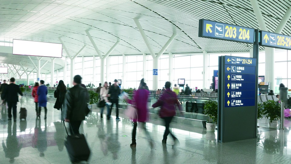
I am in a place filled with germs. Where people are often angry, tired, confused, and running late but forced to endure long lines and interminable walks. Where one is made to suffer indignities of invaded personal space and invasive bodily searches. And radiation. And overpriced food.
Yes, I am in an airport. Atlanta’s Hartsfield-Jackson, the world’s busiest. And I plan to spend the day here.
Why would anyone subject themselves to this environment if they’re not going anywhere?
I'm here to meet Jim Harding. Harding is in his early fifties, married with two daughters. He has thinning hair and a goatee. With an engaging warmth and a Nashville accent, he looks me in the eye and smiles broadly, then says, “No one grows up saying, ‘I want to be in wayfinding!’”
When is the last time you’ve been to an airport, checked in, made your way through security, walked to your gate, used the restroom, bought a sandwich, then boarded your flight without getting confused, disoriented, or lost? For frequent travelers, hopefully this is the norm.
Yet we don’t think, “What great signs they have here! I found everything so easily.”
If Harding performs his job perfectly you will never think of him or his work. Its very success enables us to have our minds engaged elsewhere. In fact, the only time we tend to be aware of his craft is when it’s done poorly—when we are frustrated because we can’t find what we are looking for. Wayfinding, Harding’s specialty, is the process of designing cues—from signage to lighting and color, even the architecture, anything at all—to help people navigate a built environment. I’m here to see the art and craft behind creating what is right in front of us but which we rarely notice.
We’re riding the “Plane Train,” officially an Automated People Mover (which looks like most airport monorails, though it’s technically not a monorail), which shuttles between the domestic and international terminals, making stops at the various concourses along the way. Harding, a principal at the design firm Gresham, Smith and Partners, leads their environmental graphic design group, whose prime role is creating wayfinding systems for large, complex environments, including the recently completed Maynard H. Jackson Jr. International Terminal here at ATL (as I’ll refer to the airport as a whole). I don’t understand why he wants us to begin our day on the Plane Train rather than in the terminal he worked on. But Harding has a plan.
As we ride the train toward the international terminal we study a map posted on the interior wall of our car. “Why are we on the train instead of in the terminal I worked on? It’s all about the Ripple Effect,” says Harding.
Wayfinding in one area of a large structure or environment always affects and is affected by the wayfinding in the rest of the complex. “It’s like a spiderweb,” he says. “You can’t touch one spot without making the whole web move.” For example, though the international terminal was the focus of Harding’s team’s work, every single one of the thousands of old maps of the airport throughout the complex, in the various concourses, the domestic terminal, the Plane Train (like the one we’re looking at), the parking garages, the website, et cetera, all had to be redone to include the newly built concourse and terminal.
When undertaking a major wayfinding project like the one at the Maynard Jackson Terminal, as the ripple effect on the maps shows, everything outside the core area must be tied in to the master plan. On the roads encircling Maynard Jackson the top of every street sign related to the terminal has a slightly curved edge, echoing the gentle undulating aesthetics of the terminal’s roofline. It’s a subtle, likely subconscious wayfinding cue, letting you know you are in the vicinity of the international terminal. Many of the interior signs share this shape as well. This distinguishes the area from the domestic terminal and concourses, where all the signs are a standard rectilinear shape. If you are ever in an airport or campus or hospital or other complex environment and suddenly something feels off, you sense you are going the wrong way, there’s a good chance it’s not just magic or some brilliant internal directional sense, but rather you may be responding to a subconscious cue like the change of shape from one sign system to another. “Signage isn’t only about consistency in terminology and typefaces,” says Harding, but also about placing the overall ecosystem in a particular frame. It establishes a sense of place.
We depart the train and arrive downstairs at the international terminal, as if we are travelers making a connecting flight. In the low-ceilinged claustrophobic space we’re met by a large horizontal sign hanging from the ceiling. On a pewter background is bold white text listing concourses, gates, and other information. It has the same clean look of airport and highway signage everywhere. And that’s not an accident.
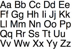
As you walk around any large public environment—airports, museums, hospitals, cities—you’ll notice that nearly every sign is written in a sans serif typeface. (Serifs are small lines sticking off the end of letters, like little tails. Most books and some text-heavy websites, such as the one you are reading now, are in serif fonts because it’s believed that they make lengthy close text easier to read.) But with near-absolute universality public signs are in sans serif.
The ubiquity of one sans serif font in particular, Helvetica, not just in signage but also corporate logos—employed by scores of global brands from BMW to American Apparel to 3M to, yes, airlines, including Lufthansa and the now-retired iconic American Airlines logotype—has been well documented and much discussed. (Amazingly, Helvetic Airways, a small airline out of Switzerland, the home of the typeface, does not use Helvetica for its logo. As the graphic designer Marc Levitt told me when I sent him an image of the airline’s logotype: “I can’t tell if it’s the biggest oversight in the history of design or if it’s a bold decision to not go with the obvious.”)
Sans serif fonts’ domination today in every environment other than long-form text has to do with a certain global aesthetic toward minimalism, and in the case of Helvetica, its supposed neutral character. But for wayfinding experts sans serif fonts prevail on every sign for one reason: They are easier to read, especially so at a distance. Innumerable studies support this notion. But degrees of legibility go beyond simply choosing sans serif. A lowercase letter “a” in the wrong font may look like an “o” from far away, for example. Within wayfinding, certain sans serif fonts, often specifically designed with distance viewing and legibility as their purpose, rule. Just three fonts, Helvetica, Frutiger, and Clearview, are used in more than three-quarters of airports. (Frutiger, which is the font on the sign in front of us and most of the signs at Maynard Jackson, in fact, was initially designed for Charles de Gaulle Airport in France in 1975.)
Aside from deciding which typeface to use, there’s a seemingly endless list of other concerns regarding the presentation of text. Spacing between the letters, words, and lines on signs is also intensely considered and tested for legibility. A study was even conducted to find the most legible style of arrow to use. Then one must consider the size and placement of the arrows relative to the text ... Very, very little in the style of an airport sign is arbitrary.
And yet all of this attention to detail is in service of the work essentially passing unnoticed. We of course see Harding’s signs, but they often are most effective when they function as a kind of transient, touching just the most superficial (or perhaps, conversely, subconscious) part of our brains, conveying information without drawing attention to the conveyer. “Ultimately,” Harding says, “if we do our job well, wayfinding enhances the customer experience without them knowing why or how.” For most of us, having our work seen, or gaining recognition or a higher profile, is a key measure of success, yet for Harding invisibility is a mark of honor.
Why do a few of us like Harding perform our jobs at a masterly level while the rest of us fall short? Intriguingly, perhaps it’s invisibility itself, the lack of promise of ever gaining recognition, that offers at least one answer. There’s a host of research that suggests external factors such as reward systems or the opinion of others—what are known as “extrinsic” motivators—can actually decrease people’s performance in sophisticated work.
To pick one oft-cited experiment, the psychologist Sam Glucksberg, now at Princeton, found that when participants were incentivized with a monetary reward to complete a complex task that required creative thinking they actually executed the task slower than participants who were simply asked to complete the task without the cash enticement. It’s theorized that external rewards can narrow people’s focus, shutting down a wider view that’s essential when tasks require creative thinking. Though money was used in the experiment, money and recognition both are considered key extrinsic motivators and one could reasonably be substituted for the other (research has shown that in numerous cultures money and status, along with appearance, tend to hang together as a single cluster as extrinsic motivators).
If you want to perform difficult, creative work at a masterly level, one key could be to, at least some extent, disregard external motivators. In this respect perhaps Harding has an advantage because there is no promise of public recognition he needs to avoid thinking about. This isn’t to say that Harding and other Invisibles—as I call professionals whose work is critical yet goes largely unnoticed by the public—are indifferent to outside rewards, only that with near-unanimity they run second to rewards and motives derived from within.
We’ve grown to expect mediocre and even subpar service, products, and experiences in almost every aspect of our lives. And if any of them work out well we notice it—a great waiter receives a better tip, a powerful film gets rave reviews, a flight landing on time is met with relief and sometimes even applause from the passengers. Yet for Harding, flawlessness is expected. The beauty of his work, when done right, is its invisibility. No ones leaves a compliment about the wayfinding in an airport comments box. His work directly affects thousands upon thousands of people every day, yet they never know to appreciate when he’s done an excellent job.
And yet silence as affirmation is essentially the opposite of what most of us are bred to desire and expect. (It starts young. As my two-year-old climbs a set of stairs I find myself absentmindedly saying “good job” with every step.) I ask Harding, when your end user expects perfection yet doesn’t notice when it’s been achieved, where is the reward? “There is a tremendous amount of satisfaction that comes from seeing a finished project, when you see it come to fruition. I still have a hard time explaining to my mom and dad what I do. So if I was in this work for accolades or public attention I would have gotten out a long time ago,” he says. Beyond that, he relishes the “challenge of solving the wayfinding puzzle."
“All of these projects are the same but different. People getting lost is the same problem but the solution is always different. I like plowing new ground. Every project gives me something I’ve never seen before.”
Harding considers my question again for a moment. “There was a two-million-square-foot hospital in the Florida panhandle. They had great satisfaction scores on everything except the wayfinding. It was at 26 percent. A year after we did a redesign it jumped to eighty-four percent! That was great but getting that kind of feedback is rare.”
Considering the specificity of the percentages he’s able to recall, one tends to believe him about the rarity of receiving an assessment of the work. “What keeps me going is just knowing internally that a job was well done. And enjoying the process of the work itself.”
This post is adapted from David Zweig's Invisibles: The Power of Anonymous Work in an Age of Relentless Self-Promotion.