

LinkedIn Just Released New InMail Analytics Features to Help You Get More Responses

If you’re like most recruiters, you send InMails all the time, but you don’t look at InMail Analytics all that often. Today’s update might change that: InMail Analytics just got a lot more useful—and easier to use.
Now you can quickly see:
- Your current response rate and performance over time
- What kind of candidates respond the most - based on time in role, schools, companies and more
- How your response rate compares to industry benchmarks for similar recruiters
- Which InMail templates get the most responses
- Your entire team’s performance
These insights can help you improve your response rate by seeing what messages work and which types of candidates are most likely to respond. Along with bumping up your response rate, you can also use these stats to have data-driven talks with your stakeholders (and look super smart in front of your boss).
Let’s look at how the new InMail Analytics works.
The simple new report shows your performance at a glance
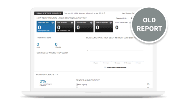
The first thing you’ll notice is this sleek new graph, which shows your response rate over time, along with how many InMails you’ve sent and how candidates responded. While the old reports took a day or two to refresh, the new InMail Analytics gets updated every few hours.
You’ll be able to spot trends and see how you stack up against industry benchmarks. Seeing your performance is one thing, but it’s not the same thing as actually improving it. That brings us to our next feature.
Segments let you see what kind of candidates respond the most and which templates are most effective
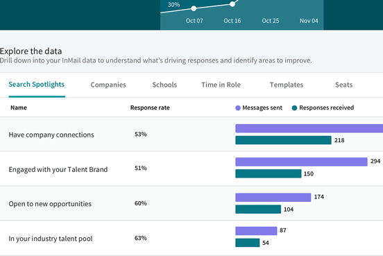
If you’re looking to improve your response rate, here’s the best place to get insights you can immediately act on. The new InMail Analytics breaks your audience down into multiple groups, so you can see which types of candidates respond more and which ones respond less.
You can explore these segments across several new tabs:
- Search Spotlights shows the responses of unique segments (the same ones that appear in search results), like candidates open to new opportunities and ones with connections to your organization.
- Companies lets you see how candidates from different organizations respond to your InMails.
- Schools shows whether candidates from different alma maters have a higher response rate to your InMails.
- Time in role breaks down how candidates are responding to your InMails based on how long they’ve been in their current job.
When you spot an outlier—a segment that’s responding much better or much worse—you can search more effectively to help improve your performance. Reach out to more promising segments and use up fewer InMails on candidates who reply less often.
Refine your InMail templates by finding out which ones perform the best (and which templates do the worst)
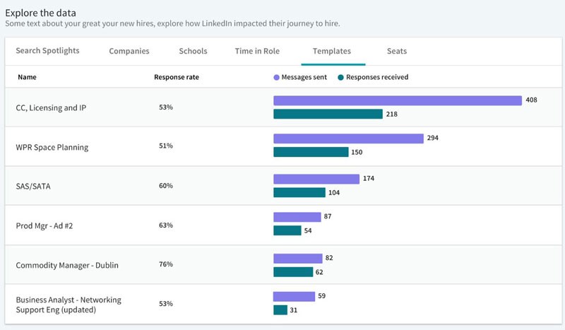
We’ve shown that candidates tend to be 15% more responsive to personalized InMails vs. templates, and you can (and should) even personalize messages sent with templates. Even when you’re adding in personal details, you can base your message on different templates for various roles or use templates to try out different InMail structures.
Of course, you never had an easy way to compare template performance head-to-head—until now.
The new InMail Analytics lets you easily see which of your recruiting templates perform best. Keep working from the best templates and edit those that underperform (taking your cues from the ones that worked well).
Easy-to-understand stats mean you can have smarter, more strategic conversations with your stakeholders
Managers often give recruiters certain directives, like “target these five companies more” or “we need to source from those six schools.” Recruiters out there in the field might know better that half of those targets will be dead-ends, but it can be hard to make that argument with nothing more than a hunch.
Now recruiters and hiring managers can easily access crystal clear data to see what’s working and what’s not. Recruiters can come back with hard numbers—“look, these three schools are responding twice as much as the others”—and get managers to understand where things stand at a glance.
Whether you need to drill down on the sources that are working or expand your search, managers and recruiters can come to those conclusions faster thanks to the intuitive visualizations.
Managers can analyze team performance, find top performers, and share insights with business leaders to influence hiring strategies

The new InMail Analytics offers a lot to recruiters, but we didn’t forget about the team leads either.
The Seats view allows managers to see how their entire team is doing, both as a whole and on an individual basis. That means you can find out which recruiters get the most responses, see what they’re doing differently, and share those best practices with the whole team. You’ve talked about creating a culture of collaboration—here’s an easy way to help make it a reality.
Managers can assess whether new strategies and initiatives are working over time—and share the results with their bosses. If you ever need to go to the C-suite to ask for more resources or greater support, you’ll fare a lot better with real data in hand.
Every great hire starts with a conversation—it’s just a matter of finding the right people and sparking those conversations. With the new InMail Analytics Report, LinkedIn has made that process a bit easier and a lot more effective.
Along with the InMail Analytics Report, we’ve released several other new features this spring including new search filters and updates to Jobs on mobile. Find out more here.
To receive blog posts like this one straight in your inbox, subscribe to the blog newsletter.

Topics: LinkedIn product tips
Related articles