
5 Tips for Better Materials
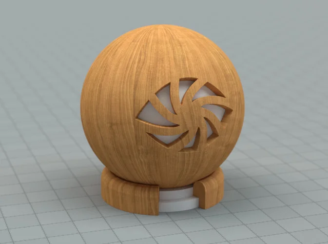
A wood texture slapped on a diffuse shader. Bleh.
Shading (the process of setting up materials) is an often over-looked step in the CG pipeline. I used to just play with the material settings until it looked a bit like what I was trying to make, and then move onto texturing thinking that that was all there is to it.
However, in my never-ending quest for realism I've come to realize that shading is in fact the most important step in creating something believable.
Of course modelling, texturing, lighting and all the rest are also very important, but shading is what determines how tangible your surfaces appear – it shows your audience what it might feel like to touch; how soft, sticky, or flexible it might be, and what it might be like to live in this new world that you've created with your render.
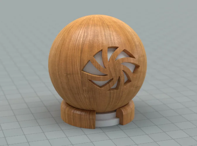
Now that’s a much more interesting surface!
Shading is a big mix of math, rules, and artistic freedom, but in this post I'll focus on the actual process of shading in a practical sense instead of just preaching theory.
1. Understand how it's made
Studying what something looks like by gathering references is the first step, but if we really want to push ourselves further and stand out from the rabble, we need to study why it looks like that.
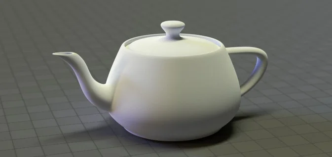
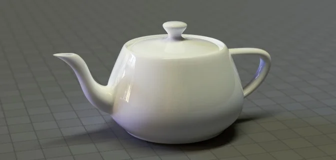
Lets take a simple ceramic teapot for example.
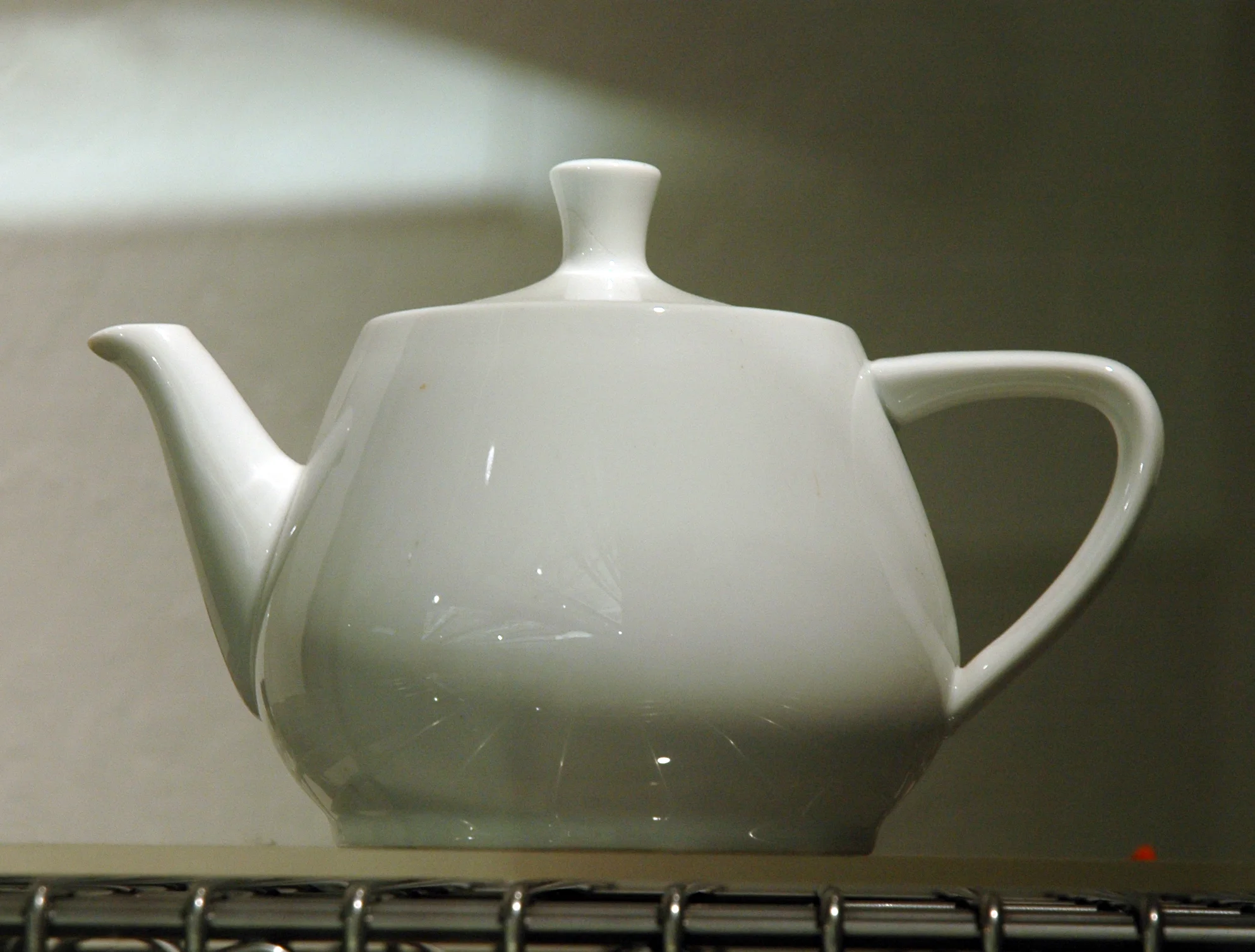
The original Utah Teapot (taken by Marshall Astor)
OK, so it looks to be pretty much like a diffuse surface with a glossy coating right?
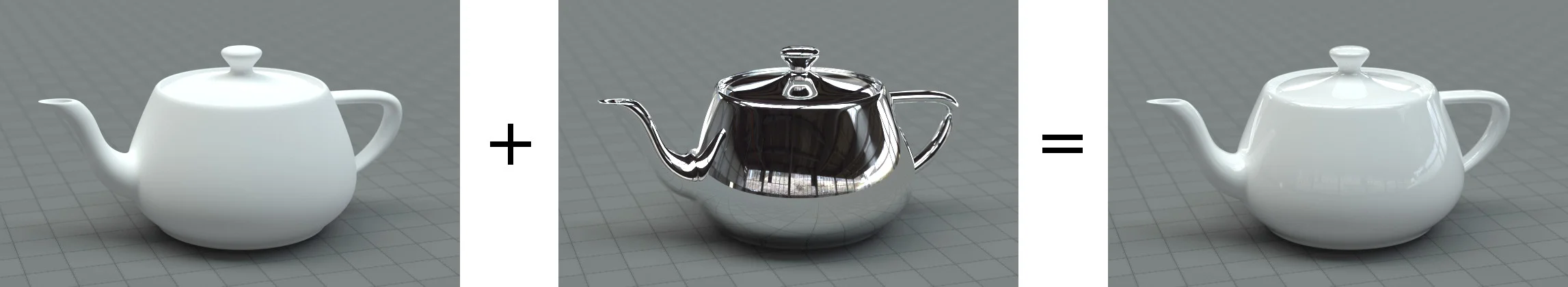

Diffuse + Glossy = Ceramic?
Sure, you could get away with that. But if you really want to push the realism of your render, lets break it down...
“Ceramic” is a pretty broad category of materials which includes tableware, bricks, glass, and even the heat-resistant tiles on Space Shuttles. We only care about teapots though, so lets say we're making a porcelain teapot.
Porcelain is made by mixing some fine mineral powders together with water to form a sort of clay. Artists then sculpt the clay into a certain shape, and put it in a kiln to fire at 1000°C. Firing it removes all the moisture, leaving just the dry, hardened minerals behind.

(photo credit: Macy Home)
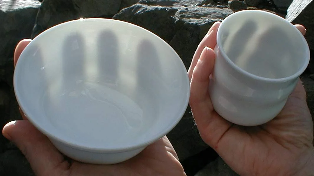
At this point it looks a lot like a plain diffuse shader, but you might notice it's also quite translucent. This comes from the choice of minerals used to make the clay – kaolin is the primary substance, but other substances like quartz and feldspar are usually included in the mixture too.
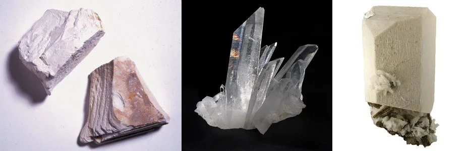
Quartz is almost completely transparent like glass (in fact quartz is used to make glass), so when ground into a powder and mixed with the more diffuse substances, kaolin and feldspar, we get a slightly translucent diffuse material.
(photo credit: Jon Singer)
After firing the sculpture for the first time to remove the moisture, it is usually coated in enamel to give it a protective glossy coating before being fired for a second time – this is what makes the surface reflective.
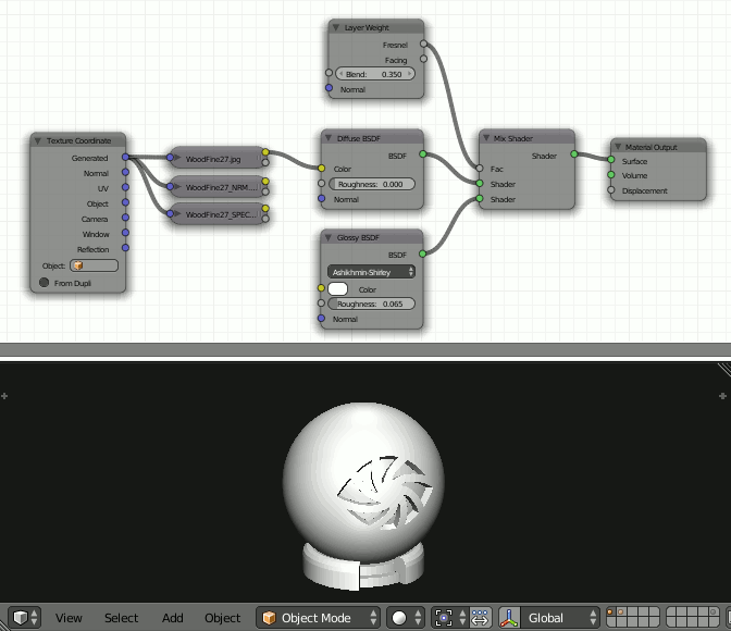
So lets translate that to a Blender material...
I always like to start with the diffuse component. Because porcelain is basically condensed powder, the surface is quite rough before the glossy enamel coating is added. So lets account for that by increasing the roughness slider of the diffuse shader a bit:

And for the translucency, lets actually use a Subsurface Scattering shader, since that's more accurate. In fact, let's use two of them! One with a larger scale than the other, to make a slightly softer fall-off:

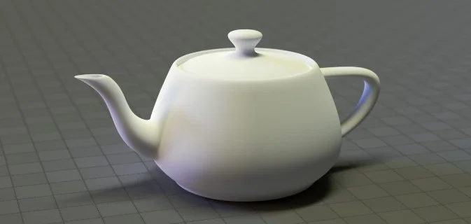
Now it looks nice and soft, much less boring :)
If you don't see it, here's a comparison gif. I know the difference is subtle, but that's what shading is all about - the final step towards realism is always made with small, deliberate improvements.
Now let's add those reflections:

(note: it's a coincidence that all the Mix factors are 0.35, there's nothing special about this)
As you can see, I used a Layer Weight node to mix in the glossy shader (the reflections). This is super important, and warrants a section all on its own...
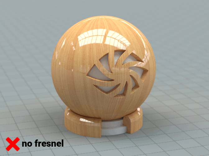
2. Fresnel Reflections
You cannot have an post about shading without at least some mention of fresnel (pronounced "fruh-nel") – in my opinion it's the most important and fundamental shading rule next to energy conservation.
So what is it? It's a simple rule that light is more likely to be reflected at grazing angles than it is if it hits the surface dead-on.
Far too many times I see renders that are missing fresnel reflections, and because of that, it instantly feels fake.
This is what the function looks like:

To use it correctly, simply plug the Fresnel or Layer Weight node into the Factor of your Mix Shader:

The Fresnel node and the Layer Weight node both give you a similar output. The difference is that the Fresnel node lets you choose the IOR (Index of Refraction) - which is helpful if you know the specificIORvalue of the material you're making - and the Layer Weight node lets you simply eye-ball the amount of reflection you want using a value between 0 and 1.
3. Make sure there's something to reflect
I often see people struggling to make a metallic material because they're using a simple sun lamp with a plain grey background.
Metals are often mostly reflective, so it's impossible to tell whether you've got it right or not without having something to reflect.
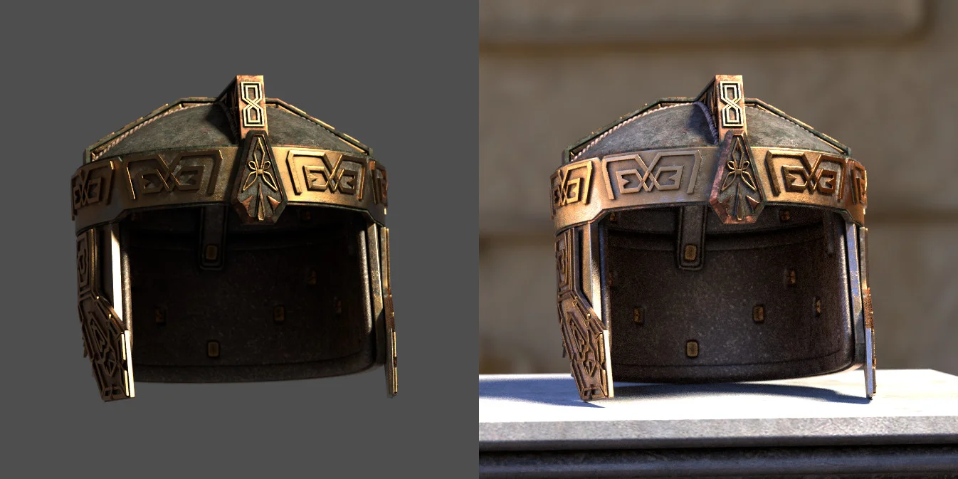
In fact most materials are at least partially reflective, so it's a good idea to make sure you've always got something in your scene that you'll be able to see in the reflections.
The easiest (and most render-efficient) way to add a source of reflections is to use an HDR environment image. I usually recommend using these for lighting because (if they were photographed correctly) they give you an accurate copy of lighting from the real world.
4. Look at what you're doing
Have you ever tried modelling with your eyes closed? I didn't think so ;)
So why do you create your materials without constantly checking what it looks like on your model?

One of the first things I added to the Node Wrangler add-on is an Emission Viewer – basically like the viewer node from the compositor, but for shading.
If you Ctrl+Shift+Click on a node, it connects it to a “viewer” node (which is actually just an Emission Shader) to show you what what you clicked on looks like. If you keep a small 3D View open, you can easily watch what you're doing and explore every node parameter quickly.
5. Use multiple light set-ups
Many times I've spent hours shading some asset for a project, but then when I import it into the main scene it looks nothing like what I thought I'd made. This is because the lighting in the scene was very different from what I'd shaded with.
If you're only working on a single still image, it's fine to shade things using a lighting setup similar to what you'll use in the end. But if you're working on something for an animation, film or game, then you need to pay more attention to how your shader actually looks under various kinds of lighting.
To do this, I like to keep a collection of different HDRIs, as well as some .blend files with different sets of lamps. Then a couple times during the shading process, I swap out the lighting with a different set-up. This way I know that whatever lighting I use, my asset will always look its best.
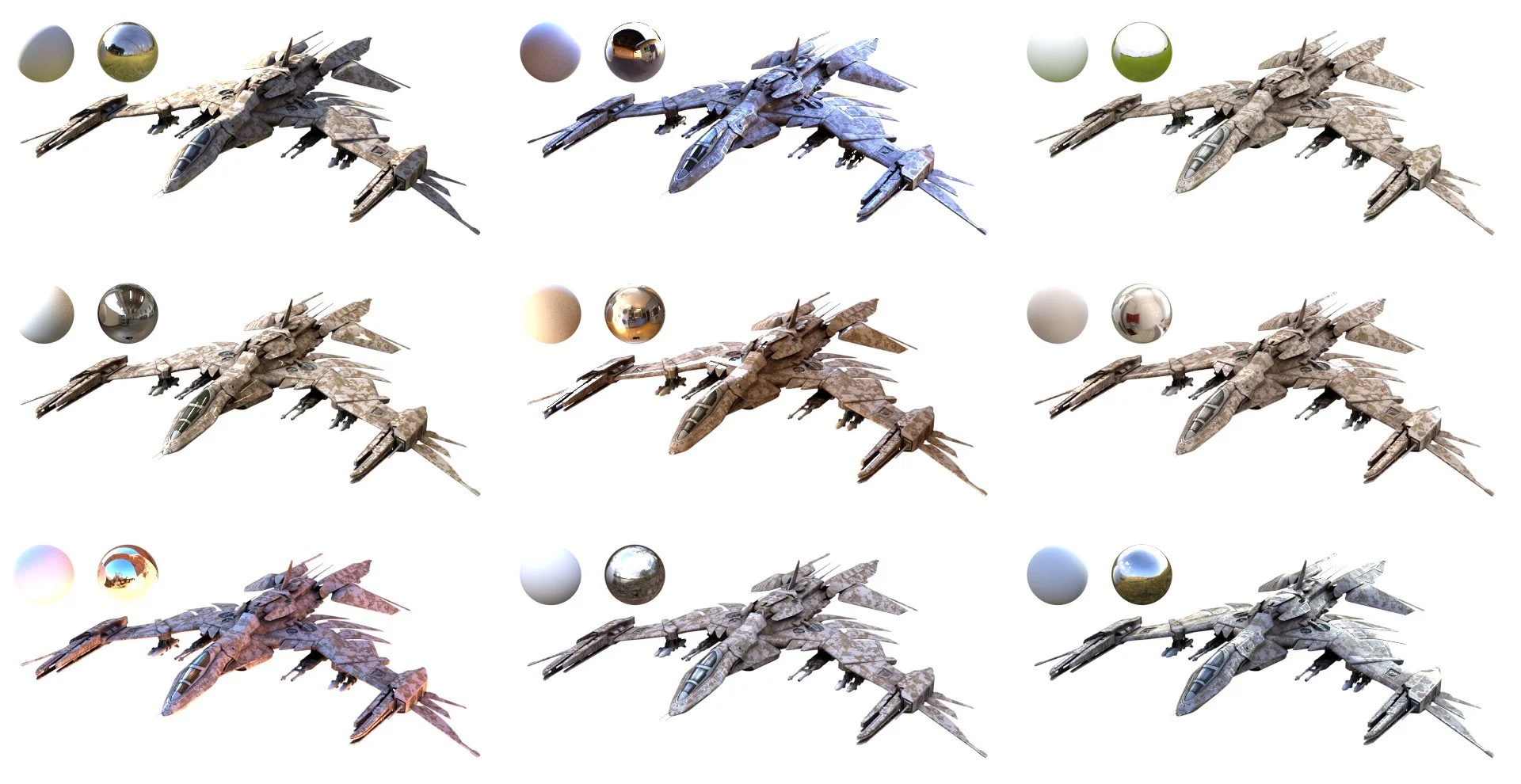
A model by Chris Kuhn, lit using 9 different HDRIs
PS. If the idea of using multiple HDRs sounds intimidating, fear not. Because in July we'll be releasing a new HDR library addon, that gives you quick access to dozens of professional HDRs. Stay tuned ;)
So that's it! I hope there wasn't too much boring theory to plough through, and I especially hope you'll remember these the next time you start your materials :)
If you're interested in learning more about shading theory and the practical application of that theory, I'd highly recommend reading these two posts from Marmoset: