The Queleña
by Jenifer Tracy on 01/29/2015 | 1 Minute Read
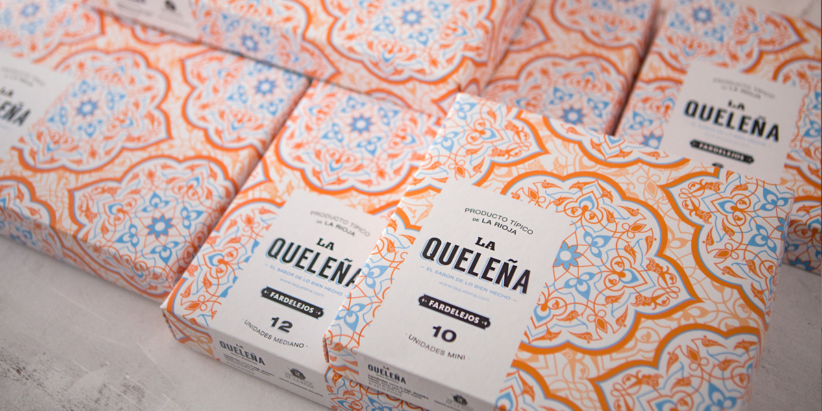
La Queleña Fardelejos is a beautifully packaged Arabian dessert which can thank it’s good looks to TSMGO (The show must go on), a Spanish design studio. TSMGO was tasked with creating a design for this product which would be easily recognized by the consumer, while also creating new customer interest.
“So as to stand out from other producers, instead of using a Fardelejo (the dessert), this has been substituted by a pattern, in the shape of an almond, that reminds us of the origin and tradition of this sweet and that unites its colours, as it is sold largely in craft fairs and the product is exposed, showing the content that is easily identifiable and stands out from other brands.”TSMGO created a design which was inspired by the regional origin of the dessert. That inspiration was found in Arabian architectural structures, Arabesque style patterning and the incorporation of the almond shape into the design, since the almond is the key ingredient in the dessert.
“Arabesque patterns are the thread that runs through the whole product range and reinforces its origin as a dessert with Arabian influences from the 9th and 10th century.”A beautiful Arabesque-style patterning was created, the patterning itself is intricate and complex but doesn’t feel busy, as it’s well balanced by the use of simple 2 color palette. The use of shapes in this design solution, with no photography, is a subtle reminder of the absence of industrilazation in this concept, once again reflecting the ancient inspiration TSMGO was working with.
The brand value of the “La Queleña” name is emphasized by the use of a bold san-serif font, a choice TSMGO made because it reminded them of packaging from the early 20th century. The use of a dark navy blue for the product name, combined with a simple white labeling allows the packaging information to be easily read even against the patterning. La Queleña’s packaging isn't simply a beautiful design. TSMGO has created a story for this brand, one infused with creativity and ancient inspiration.
“One of the prerequisites that the design team were given was to create a graphic line loaded with content and metaphors that are easily identified with the values the product is awarded with: colours, natural, value as a memory of acared crafted typography (History = tradition = origin = quality), seal of guarantee.”
Designed by TSMGO
Client: Fardelejos La Queleña
Country: Spain
Creative Director : Ricardo Moreno Rodríguez
Art Director & Graphic Designer: Marta Terrazas & José Luis Casao
Photography: Carlos Caperos Berdejo