6Ft6 has spiraled upward to new heights with their bottled wines striped in black and white. Designed by Co Partnership, the series appears to have come straight from the whimsical world of Dr. Seuss with the play on color through typographic overlay.

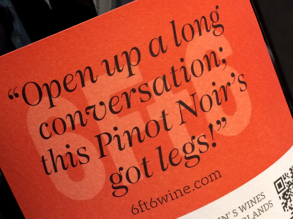


“With the ambition to become ‘The people’s Pinot’, Co Partnership worked on helping the brand change the way it speaks by creating a conversation on and off pack with positive quotes about being tall. Abbreviating the name gave the brand an immediate measurement of height, whilst creating an impactful mark and no mention of the word ‘foot’.”


“We amplified this idea with an innovative print technique, printing a random graphic element against a consistent backdrop, achieving 12 unique labels per box of single wine variety. Collotype helped with this revolutionary print technique, enabling us to do something very different to the competition.”

Strategy, Design & Copywriting: Zoe Green & Max Harkness


