
I’ll admit it. I’m that designer. I’m constantly sticking my phone in peoples’ faces and exclaiming, “Look how cool this is!”
But I’m never talking about a specific product or trending meme. I’m always talking about a unique and delightful interaction within an application—the thing that gives me the “warm fuzzies”—the microinteractions.
Microinteractions can create a massive impact, and as a software consultant, you should be paying attention to them.
What Microinteractions Are
Simply put, microinteractions are subtle, but delightful, moments used to communicate something to users. They can take all sorts of different forms. Generally though, they do one of the following:
- Confirm an action
- Provide feedback
- Communicate status
- Provide guidance
What Microinteractions Are Not
Microinteractions are not features. They are a layer of communication applied on top of a feature to make it more discoverable and/or easy to use. They are not overly ornate, and they should not become annoying or stale after experiencing them multiple times.
The Value of Microinteractions
Humans naturally want to receive feedback, but they also typically do not like being bossed around. The value in microinteractions is that they subtly guide users without bluntly commanding them what to do. They can provide feedback in a quick and non-intrusive manner. Doing so creates a human-like experience within a piece of otherwise non-human feeling software.
Well-executed microinteractions will give your users the warm fuzzies, the thing that makes them shove their phone in a friend’s face and exclaim, “Look how cool this is!”
Where to Include Microinteractions
Because microinteractions are subtle, there are endless opportunities to insert them. Here are a few common approaches:
Indicate direction
Place microinteractions in strategic locations to guide users. For example, placing movement right above the fold will imply that the user may scroll to see more content.
Highlight changes
Use microinteractions to highlight changes and validate user input. The Twitter heart animation is a great example of this. It validates to users that they did, indeed, favorite a tweet.

The key is that it does so in an endearing way, which doesn’t get stale or annoying after seeing it time and time again.
Retain context
Apply microinteractions to signify where users are currently or where they are being taken to next, in context to where they previously were.
This can be as simple as zooming from a selected card into a new screen.
Indicate status
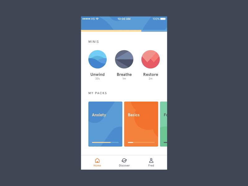
Implement microinteractions in ways that communicate status, such as loading animations or progress indicators.

This will indicate that something is happening in the background. If done well, it will also keep the user from getting bored as the page loads.
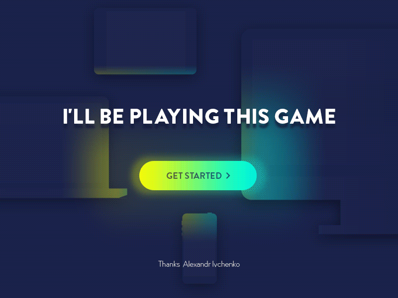
Emphasize a call to action
Micro interactions can also direct the user’s attention. Are you trying to get more sign-ups or pushing a certain product? Applying subtle animation to a button, image, or text can make it more prominent, catching the attention of the user.
Give the Warm Fuzzies
As software consultants, we’re all on a mission to make our users’ lives better. Sure, we mostly deliver on that goal by creating a product that solves a problem our users have. But we can over-deliver by making the experience truly enjoyable.
Microinteractions are the details that change a product from something that “gets the job done” to something that people will be excited to continue interacting with time and time again. Strive to solve problems and give the warm fuzzies.