
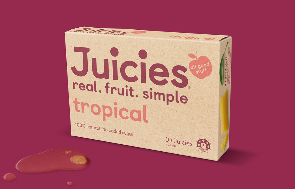
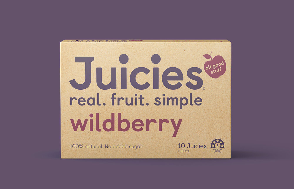
Dow Design Ltd designed the rebranding and packaging for Juicies, a line of natural juices popular in New Zealand. The simplified new look focuses on the wholesome feeling that Juicies embodies.

“Wabi sabi.
No, not wasabi. But the ancient Japanese philosophy of appreciating beauty in the naturally imperfect. That was kind of what inspired our complete reinvention of Juicies, a brand that many of us had grown up with in school tuck shops. The trouble was that no one kept buying Juicies after they left school. And we put it down to the fact that no one could see how simple and natural and good Juicies really were. In fact, their ingredient list was far simpler than their competitors’. They may not be the most perfectly shaped, and they may have a funny little wrapper, but those very imperfections are part of what make them so appreciated.”


Designed By: Dow Design Ltd
Client: Tasman Bay Food Group Ltd
Creative Director: Donna McCort
Lead Designer: Kirsty Harvey
Account Manager: Michael Statham
Design Team: Jeannie Burnside
Artwork/Production: Ben Dean, Carl Dixon
Photography: Shaun Cato, Jamie Pettigrew
Location: Auckland, New Zealand


