We’ve talked about how to start following the principles of accessibility. Now we’re going to dig into the nuts and bolts with a real-life example of one of the simplest ways to save time and tedium for users working with assistive technologies. Today, we’re talking about skip links.
How do Screen Readers and Limited-switch Assistive Devices Work?
Let’s start with a brief overview of how screen readers and limited-switch assistive devices work. When a user first navigates to a webpage or opens an app, some element on the page has keyboard focus. The developer can define this order by setting the tabindex attribute of the element (to 0, 1, 2, and so on).
Screen readers and assistive input devices often work by moving focus from one element to the next on a keyboard tap or a timer. When focus finally makes it to the element of interest, the user can either consume the element’s content via a screenreader or interact with the element using their input device.
Here’s where the tedium comes in. Many apps and web pages include navigation links, headers, or other common content on each page. If the primary value of your app is for users to consume some main content on the page, they probably won’t need those links very often. But when working with assistive technologies, the user will likely need to move focus over each and every one of your “Home,” “About,” “Contact Us,” etc. elements every single time they visit the app.
Giving Better Value, More Quickly with Skip Links
What if we could give the user an easy way to move focus right to the good stuff, so they could start getting value out out your app right away?

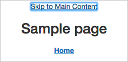
<div id="skip" tabindex="0"><a href="#maincontent">Skip to Main Content</a></div>
Here’s an example of a skip link. Following it brings focus directly to the most important content on the page. It’s the first element on the page, so it’s easy for users working with assistive technologies to find, and it saves a bunch of time that they would have spent tabbing through things they don’t need.
Skip Link Styling
“But wait,” you say, “This link totally interrupts the flow of my design!” Have no fear–we can protect the integrity of your visual design while still providing this time-saving tool for users who look for it. Let’s add some styling, so that the link is there when we need it and not when we don’t:
#skip a
{
position:absolute;
top:auto;
width:0px;
height:0px;
overflow:hidden;
}

#skip a:focus
{
position:static;
width:auto;
height:auto;
}
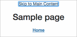
With this styling, the link is invisible unless we deliberately move keyboard focus to it, but it’s still the very first element that keyboard focus will find. Go ahead and try it out: Drop this code into your app, reload the page, note the absence of any design disturbances, and then hit tab. You should see the “skip to main content” link appear. When you tab away, it will happily hide itself out of the way again. Make sure to confirm that the link moves focus to your most important content, and you’re good to go!
Towards Greater Software Accessibility
There we have it: a nice and simple way to make your app more comfortable for users working with assistive technologies. This tip is one of many steps you can take to start adhering to the WCAG principles.
Thanks for the explanation, going to implement this now