
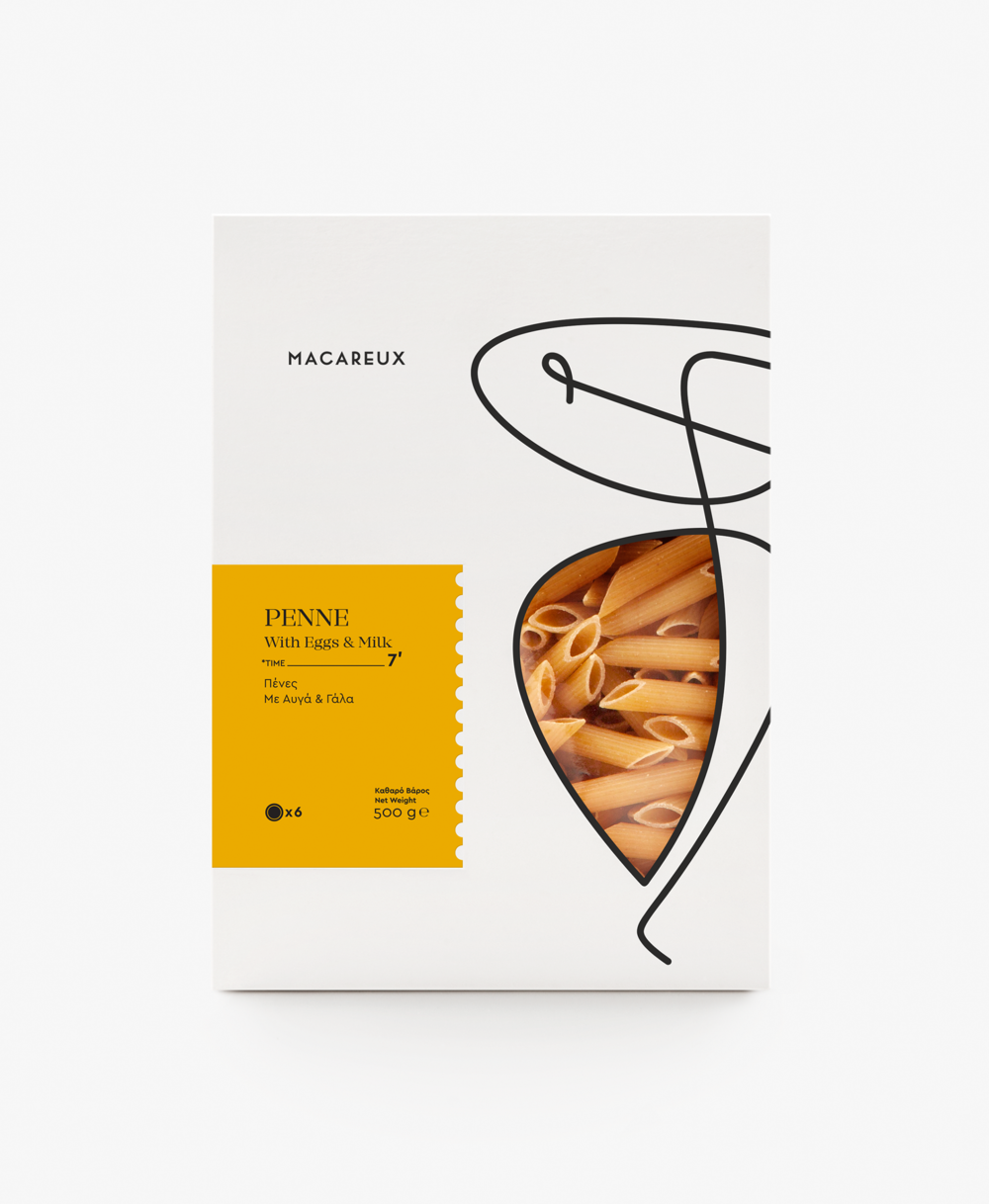
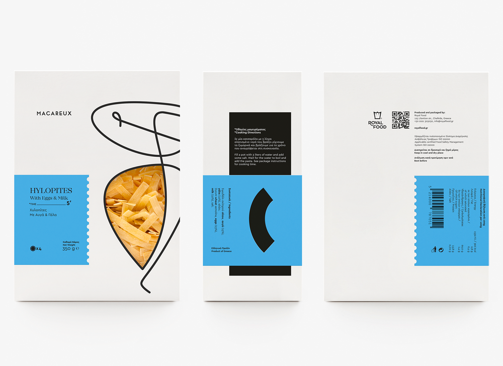
Add a little pizzazz to your pantry with Macareux’s new line of nutritional pasta. Designed by the Luminous Design Group, playful pasta in all shapes and sizes are gathered into color packaging that stands out on supermarket shelves. Minimal with a pop of red, blue, yellow or green is what separates Macareux from its competitors. With the addition of pasta icons and an abstract line drawing that frames the window, this brand invites and encourages consumers to experiment with cooking and find their passion in doing so.

“A packaging series for high-value nutritional pasta. The Atlantic puffins, also called Macareux [makarø], helped us with naming and creating the logo, by highlighting the delicate but also multifaceted product’s nature. They also showed us a way to a create a black & white container that distinguishes itself through the color palette of its labels.”


Designed by Luminous Design Group
Country: Greece


