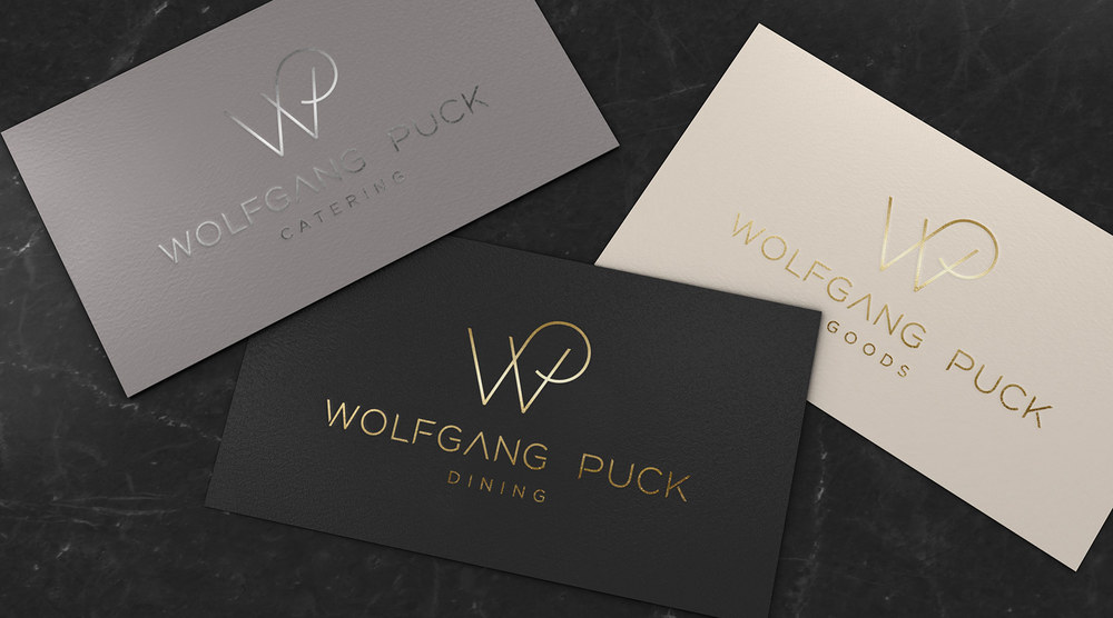
Culinary icon Wolfgang Puck gets a phenomenal makeover from Pearlfisher. Updated to fit the modern day consumer, the brand’s identity has been simplified bringing the quality of the packaging up a notch. The overall design beautifully expresses Wolfgang Puck’s philosophy with a sophisticated logo that ties in tradition with contemporary cuisine.
“In an increasingly competitive landscape and with a wide variety of offerings, audiences and price points, the Wolfgang Puck brand lost some of its single-mindedness.In partnership with Wolfgang Puck, our Strategy studio ideated a new brand positioning that blends Chef Puck’s characteristic warmth with his cutting-edge culinary acumen, and reconstructed the brand architecture in a way that is both intuitive and efficient.
Inspired by the sharp edges of chef knives, our visual identity system captures Chef Puck’s role as a forward-thinking pioneer of the industry.”